.
"Everyone is born creative; everyone is given a box of crayons in kindergarten. Then when you hit puberty they take the crayons away and replace them with books on algebra etc. "
That's Hugh MacLeod from his book, Ignore Everybody. Last year Hugh managed to hit both the Amazon and Wall Street Journal Top Ten Lists for business books with a book of what? Well, cartoons for at least 1/2 of it, and smart ideas about creativity for the second half. And do you think anyone in New York was looking for a business book with cartoons in it before Hugh? Well, of course not, but he hit a nerve that had probably been long under-tapped in that his book managed to combine both words and pictures in a way that spawned new ideas - and a valuable following of readers and social participants as well.
You see, Hugh's book isn't just a book, it's more just the tip of an iceberg of a philosophy and a business that includes active participation in his blog and his web community of "Crazy Deranged Fools"- many of whom buy art and wine and other things that are part of Hugh's total product mix. I've known Hugh for twenty years now and I can tell you, he has never been able to work in just words or pictures alone - he has always required both. And I think a great many of us are the same way. It's just that the Internet, or at least the social networks have not found the value in addressing us that way yet. Now we want our crayons back. We want to be able to communicate in the way that is most natural to us. We want our communication and indeed our networking to be well, easier, more comforting.
This whole train of thought for this post started for me weeks ago and it has occupied a number of A4 sheets of discarded printer paper of which I use to keep errant notes for blog posts although many of the ideas have been drawn from my life in communications and percolating for years. This iteration began by seeing Mark Pincas on The Charlie Rose Show, followed by Director, Tim Burton discussing a retrospective of his artwork at MoMA in New York. Mark Pincas is the founder of Xynga games and for those who don't know, that is the company responsible for the Mafia Wars and FarmVille games, most popularly seen and played on Facebook. But that was not what interested me, nor the supposed 15 billion dollar market in virtual games of which he said 1-2% of the players actually pay for. What interested me, is that these are primarily 'visual' concepts, as is online Poker - and I couldn't think of very much that was visually driven about the primary social networks I have been involved in. I'll get back to this idea a bit later because I think I know why.
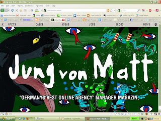
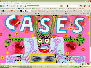
So I needed to take a look again and see what these networks were missing. (For those who will wonder why I haven't included Second Life in this comparison consider this: When the US, Japan, most of Europe and China open embassies on SL, I'll consider them part of the same market. Until then, their level of suspension of disbelief is just a boatload higher than most people are willing to go for a real social network. You wanna hire my Avatar? I didn't think so. But apparently you can sleep with it. More of a pure game, albeit a social game but way far out of reality's scope here both in concept and excecution.) On the left side of this page, you'll see screenshots of my Facebook, LinkedIn, Xing, Twitter and Friendster accounts. And on the right side, you'll see the leadpage shots of the website from probably the most awarded advertising agency in Germany, Jung von Matt. Notice any difference? I thought you might.
Starti ng with Facebook, it has always perplexed me why the thing needs to look so boring. Blue, like Windows classic blue. Icky. Sure, you can run around the program and get special 'skins' from third party suppliers, but as I understand, they either have a short shelf-life, as Facebook keeps changing their codes, or only work for your computer screen whilst everyone else sees the same boring blue screen they have always seen - so your skin change is not communication at all, just some king's new clothing for you while everyone else gets to see you naked - as usual. And all the other third-party apps? Most of them run as stand alone things and don't integrate into your workflow in the system. Oh, they'll send you a ton of crap later but visually they don't play nice with your homepage and require you to gotto 'apps' and activate them. Clumsy, I think. Much like the way they handle groups. Why don't I get a cool little audio/visual ding-dong when someone adds something to my group (the ones I moderate)? Could be insightful.
Movi ng along to LinkedIn and Xing (I categorize these together because they are both 'business' networking sites), we get - well, surprise - more blue or teal and green in Xing's case, just a slight rotation of the colour wheel. Now here we mean business and it's pretty obvious from both sites lack of personal colour choice that we shant be messing with business by painting it like a Grateful Dead album cover or god forbid Daft Punk or some sort of other electronica rot like that. No siree. In fact, a quick Google for LinkedIn skins or Xing skins gives you well, nothxing. And neither site offers anything in the way of helping yourself - so forget it. If you don't want to work for IBM, go away. Big Blue rules here as well.
But h ow much sense does that make when the agency on the right handles work for Mercedes, Nikon and Deutsche Post? Is the post office cooler than a business social networking site? Maybe. But it needs to be remembered that business takes many forms and many shapes and colours as well. Just think about all the logos and companies you already know about and how different they all are. Companies all have their own language of visual communication - and even Jung von Matt knows that. The work they do for their clients doesn't look at all like the leadpages on their website. That's just their way of representing themselves in this particular instance. And that's how it should be. Visual communication, as opposed to verbal or written communication, is like the thousands of characters in the Chinese alphabet compared to the 26 characters in the Roman alphabet or 24 in Korean. It's a world of pictures out there to the Asians and those quicker to realize and capitalize on that will be further in their user community's minds than the next guy. With Twitter, Xing and Friendster on the rise, Facebook is looking like the next guy, and already blocked in China.
Next u p Twitter. Need I say more than 140 characters? By restricting our BS, Twitter has allowed us to create 140 character novels, post pictures and even have clever little skins and widgets that personalize and communicate along with all the terse verse we can compose. But we get to do it with a wee bit of style in keeping with their wee bit of philosophy. Fair enough.
And fin ally, Friendster. Never heard of Friendster? Well 100 million other people have and a lot of those people are Chinese. Compared to 90 million on Twitter, 55 million on LinkedIn and a growing but not quite there yet 8 million or so on Xing, Friendster is on the cutting edge of visual communication in social networking, but that really is not saying so much. The site was relaunched recently with intensified visual themes to more widely appeal to an Asian audience. They feature a ton of custom skins and decorations for your own pages - and like MySpace, everyone gets to see them. I've spoken before of how living in Asia can make the web a third world country when moving back to the west because the sheer activity, not to mention rocket ship bandwidth and speed in Korea and other fast ramping Asian markets, but so much because of the history and tradition of visual communication.
Remember, Chinese characters are pictures - not letters that mean sounds or syllables like other modern alphabets and whilst Korean 'Hangul' is a mathematical and phonetic construction, Korean newspapers still feature Chinese characters interspersed with their more modern (circa 1500s) alphabet because Koreans still know what a limited amount of Chinese characters mean and relate to them intrinsically. And since the Chinese invented paper and the Koreans preceded Gutenberg with movable type by 78 years in 1377 with Jikji (Which was originally individually cast Chinese Characters) these people know a thing or two about the written word in pictures - and getting it out. Think also of the Japanese fascination with Pokemon and it's later storm through a western kid's vernacular and you'll get where I'm going. Pictures speak louder than words. And mostly to the audience to which the social networks will be making all their money off of for the next ten or twenty years - unless holographic or 3D networking wipes it all out in 2 or 3 years from now ... Continued in the next post or click here for Part II.
wHAT's wRONG wITH mY sOCIAL nETWORKING? I: Well, visually it sucks for starters...
wHAT's wRONG wITH mY sOCIAL nETWORKING? II: How Creative Direction can build Social Networks
wHAT'S wRONG wITH mY sOCIAL nETWORKING? III: Nothing Much Happened In München Today VII


